Usability testing: what, why, and the takeaways
Today I want to write about usability testing, why it’s essential, and what I’ve learned from doing it right away after creating the prototype.
What is usability testing?
This quote describes it best:
Usability testing is important because as much as we like to believe that we are building products for ourselves, each person is unique. We’ve all had unique backgrounds, lived experiences, perspectives, preferences, and abilities. All of these things influence how we understand, approach, and experience a product.
Behzod Sirjani, Founder of Yet Another Studio
Why do designers need usability testing?
It helps observe and identify users’ pain points. We can’t know if the product we created is intuitive, easy to understand, and allows users to achieve their goals. If we do testing with real people, we can see how they behave with the product, their feelings and reactions, what excites and frustrates them.
Collecting observations then leads us to analyzing what we saw, categorizing the problems and discussing how easy (or not) it would be to fix them.
This information will also allow us to iterate and improve our product, focus on the right problems and prioritize the next steps.
Usability testing reduces the risks of spending too much money and time on something that might not be a suitable feature or product.
In other words, usability testing helps evaluate how well our product meets our users’ needs based on actual live data.
Usability testing is one of the most fundamental ways to test the success of a design. Ensuring customers can find, understand, and use a solution contributes to the overall success of a product and business.
Taylor Palmer, Product Design Lead at Range
Usability Testing for Margot Community App
I worked on an app for Margot Community, which helps women and gender-marginalized individuals find mentors and provide virtual 1:1 time with them. My main focus was on improving search and booking experiences for the mentees, and the primary features were detailed filters and a calendar with a step-by-step booking process.

After going through the UX design process cycle, from conducting the survey, synthesizing the data to ideation and creating a solution, I hurried to test the app design with real people.
I finished the prototype in Figma, wrote a simple mission task, and did unmoderated remote testing using Maze. The users had to complete a task in prototype and answer a couple of close-ended and open-ended questions to help me better understand their thoughts and feelings about the app.

My first two testers couldn’t complete the task. They opened filters to narrow the search results but could not apply them and go to the next step. The list of options in my filters pop-up was quite long, and the “Apply” button was at the bottom of it, not sticking to the screen. These two users didn’t scroll down the filters, couldn’t find and use the “Apply” button, and were stuck on the previous screen. Oops.
After seeing this in Maze test results, I fixed the button in the prototype and thanked my testers dearly and wholeheartedly. Since Maze doesn’t allow updating the Figma prototype in a live test, I created a new one and sent a new link to other users.
Luckily, after improving the “Apply” button, there were no other significant obstacles, and most people completed the task and answered the questions.
The direct success for the mission completion was 64.7$, indirect — 23.5%, and give-up/bounce rate — 11.8%.

17 tester took a part in this test, with a 36.4 % misclick rate (more on this later), 64.7% average success rate, and 11.8% average bounce. Not bad.

It was vital to see these charts since search and booking phases were my main focus for this app. 29% found it easy to find a mentor, and 24% said it was very easy. 59% rated the booking process as easy, and 24% — as very easy.


Suggestions for future improvement came on a long list and were simply invaluable:

Besides sharing users’ feedback, Maze also provided their analysis of the test results:
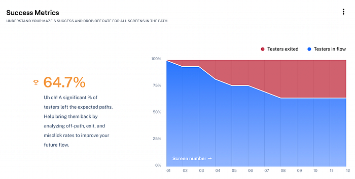
The software considered 64.7% of misclick rate as pretty high and suggested I analyze and edit my test and run it again. I was delighted to see this data and understand test outcomes better, but I didn’t consider it a negative result, unlike the Maze software. Here’s why.
Most of the testers never saw a Figma prototype before, not to mention a Maze test. They were curious to see what was in front of them, what was clickable or not, and what would happen if they tried to open a mentor’s profile right away on the first screen. The prototype and test were built to examine my booking solution with filters and a calendar, so it didn’t leave much room for people’s innate curiosity.
But this behavior implies that there should be a certain middle ground for a prototype in testing: somewhere between “A fully responsive app” and “Nothing is clickable here.”
And speaking of future improvements, I gathered the testers’ feedback and suggestions for improvement, updated the design, and created another app iteration.
By doing so, I improved the app based on the response from real users, with their pain points and wow moments in mind. This is why I think this usability testing was 100% successful.
What I’ve Learned
1. The main thing I learned from this experience is that testers don’t read the task :)
I wrote it twice, in a personal message when I shared the link to the test and in the test itself. It didn’t help :)
The task was supposed to be seen while users completed the prototype, but it was not the case for those who opened Maze on their phones.
2. The realization that most people use phones in day-to-day life and for usability tests (in this instance) was a surprise to me (my go-to device for everything is my laptop).
In this case, it would be irrelevant if some testers didn’t run into a problem where they couldn’t see the “Start” button and begin the test due to the smaller screen size of their phone. When I discovered this flaw, I made sure to ask other users to complete everything on a laptop instead of the phone just to avoid bugs that might occur on mobile.
3. I also reached out to the Maze team themselves. A couple of people said the test kept buffering and could not start at all. I contacted support, and after looking at my test, they wrote the following:
Contrary to what you might expect, we have to process the entire Figma file when loading a Figma prototype. We are not just processing the single page associated with the prototype, but the entire file. If the file is particularly large (e.g. because it has multiple pages with icons, design systems, earlier iterations, wireframes, etc) then the amount of memory needed to process it can exceed these limits and cause the prototype to crash repeatedly.
That being said, we strongly recommend duplicating your working design file in Figma so that you can tweak the copy to optimize it for use with Maze. We recommend deleting any unnecessary pages, frames, and elements and only including the minimum content you need for your test.
For more information on how to better optimize your Figma file, please see: https://help.maze.design/hc/en-us/articles/360052723313-How-to-create-a-Maze-ready-Figma-prototype
Figma also has some good information about this I would also recommend reviewing as they speak specifically about these limitations and offer some suggestions that can help: https://help.figma.com/hc/en-us/articles/360040528173
I’m leaving this here because I found these details important and very helpful. Thanks, Maze team :)
I should note that you might not run into these particular problems with your test, since good software always grows and changes over time.
4. In their suggestions for improvement, people shared what they found very convenient and easy for them in other interfaces and what was lacking in my app prototype. For example, they asked to make call-to-action buttons sticky at the bottom of the screen, sort all filters alphabetically, show them how many steps are left in the booking part, and give them an option to type into the search bar and avoid using filters. All these details would make the UI more intuitive, comfortable, and predictable for them. They’ve seen these things before and would appreciate having them here as well because they work very well. And to me, as a designer, this is a priceless insight.
It’s clear that usability testing is as vital for good design practices as the initial user research. It’s a crucial information source for future iterations and improvements of any product.
November 2021 update.
This is what I got in the email today from the Maze team:


